Kiss The Card Challenge & Twist

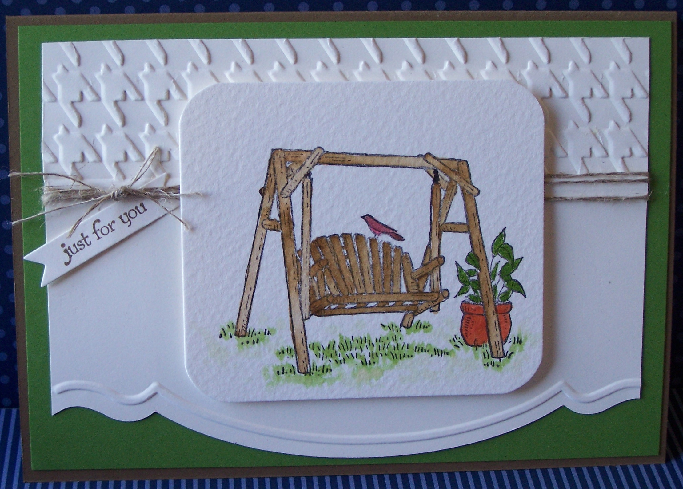
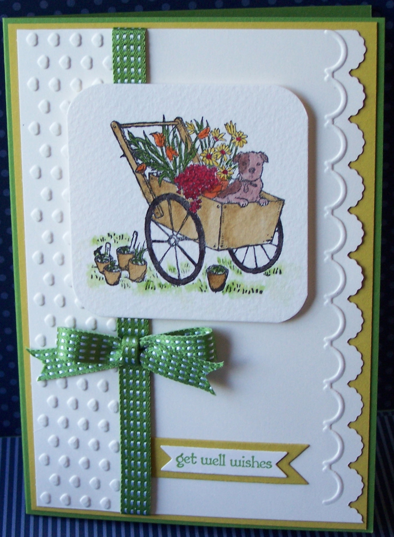
Yep you have to kiss the card!  No not really…..  This week’s challenge from Our Creative Corner comes from Lisa Minckler from You Made Me Ink, she wants us to use the kissing technique (stamp to stamp) somewhere on a card or project.
And the twist is to use the letters X and O somewhere on your project.
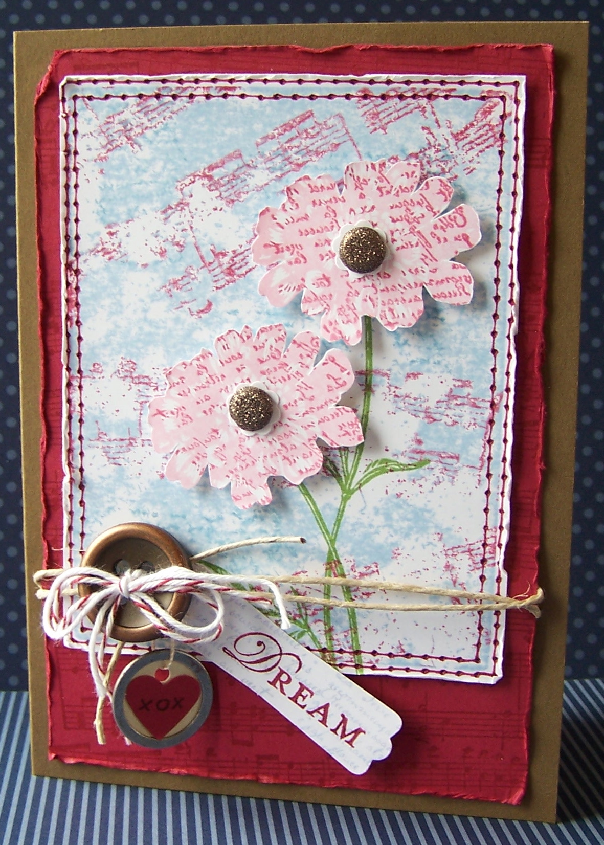
My X and O are a little hard to see in this photo, but they are on the red heart that is on the tag that is hanging down.

For the blue background, I have put ink directly onto a clear block, then I have used the Music Notes wheel with Raspberry Ripple ink over the top, and stamped it straight onto Whisper White card stock.  Be careful if you are using this technique that you stamp straight up and straight down, it is very easy for it to slide around and smudge everything (speaking from experience!!).  Those pretty flowers from Field Flowers stamp set have been inked in Pretty in Pink and then stamped again using the word stamp from French Foliage in Raspberry Ripple stamp to stamp.  Add some twine and one of the new Bushed Bronze Designer Buttons and of course some of my favourite…. faux stitching! 🙂
Check out what the rest of the Design Team have done for this challenge, and make sure you join us with your own creation this week – we love to see what you have come up with.
Happy Stamping!
Chris

Spring is here!

And I have made a card to celebrate spring!  This one uses the gorgeous Betsy’s Blossom stamp set along with a new set of patterned papers called Floral District.  The main image uses the “kissing” technique and has then been punched out using the Postage Stamp punch.
If you would like instructions on how to make this card, along with all of the bits and pieces needed to make it, just join my Stamp of the Month Club.  All the details can be found here and feel free to send me an email if you have any questions.

Happy Stamping!
Chris

Fundraising

Recently, I was asked to donate some boxed sets of cards for a charity fundraising event. I am very excited to be asked to do this, and wanted to make the box something a bit special, and I found this design on Tanya Bell‘s blog, and thought it was perfect. Thanks for sharing the tutorial for this one Tanya.

The white flap of the box opens up so that you can put the cards and envelopes inside.
For this particular box I have used Primrose Petals as the main colour, along with the Apothecary Art Stamp Set, the Framelits Labels Collection and some retired bits and pieces.  I have made two of these boxes and each has 6 of my hand crafted cards in it.
As well as that, I have also put together 250 advertising packs, each with information about my stamping business and each also has a gift tag inside.  I will show you the advertising packs in another post, but let’s just say it has definitely been a big project!
Hope you are having a crafty day.  Happy Stamping!
Chris

Orchard Harvest

Spring is here 🙂 but I am such a sucker for Autumn Colours!  I loved the Orchard Harvest Suite as soon as I saw it in the Holiday Catalogue.
This card is based on the current sketch challenge at Freshly Made Sketches.
I have used the Orchard Harvest DSP (patterned papers) and the Perfectly Preserved Stamp Set and matching Framelits Dies.
The “vases” are the corn framelit, which I have cut the top off to change the shape.  I have then run them through the Big Shot using the Square Lattice Embossing Folder, and tied some Linen Thread around them.  The gorgeous little flowers have been stamped in Raspberry Ripple and More Mustard and also cut out using the die from the set.

Here is the sketch.  I like this one, think I might have to use it for another card!
Happy Stamping!  And happy Labor Day for all of you in the US.
Chris


Resist Techniques

In this post here, I shared with you this week’s challenge at Our Creative Corner, which is to create a project using a Resist Technique, so today I am going to share with you a YouTube link, which will show you some different Resist Techniques and how to do them.


I have used the Emboss Resist technique for my card, and you can see some other techniques used in the fabulous creations from the rest of the Design Team.  So check out the YouTube, and lets see your creations too 🙂

Happy Stamping!
Chris


Artful Stampers Blog Hop

It’s time for the new Stampin’ Up! Annual Catalogue!!!  To celebrate, some of our Team – The Artful Stampers – are sharing fabulous projects showcasing a selection of the gorgeous new products available in the 2012-2013 Catalogue!!

You may have hopped here from Melissa at Bee Devine Designs Blog.  I’m stop 4 on the Hop and I’m glad you “hopped” in. 🙂  But if you started here, that’s ok too, just keep on hopping and you’ll eventually get all the way around!

Today I am going to share with you a set of three cards made with a gorgeous new Hostess Set called Summer Afternoon (Page 201 of the new Catalogue).
The cards also feature a  new set of framelits dies called Bitty Banners (Page 191) and some of the new ribbons available, the Stitched Satin Ribbon and Stitched Grosgrain Ribbon (Page 172), and some of the new In Colours.

I have used inks and Aqua brush for the water colouring on each card, on watercolour paper, and have also used a combination of the Adorning Accents Embossing Folders, and the Adorning Accents Edgelits dies.

I will give you a closer look at each card individually, so that you can see them in more detail.

The colours for this first card are Gumball Green (new In Colour) and  Soft Suede, along with a touch of Cajun Craze for the pot.  The Houndstooth Embossing Folder along the top section adds some texture and I have wrapped some Linen Thread around a few times.

The second card has a layer of Raspberry Ripple (another new In Colour) card stock with some Daffodil Delight Stitched Grosgrain Ribbon.

And the third card…. ah… here is something for you to discover… a bit of a challenge…  this particular card uses the layout of a card from the new Annual Catalogue.  The first person (only  people who are not SU demonstrators please) to correctly tell me which page the card is on that inspired my card, and the stamp set and colours used in the card in the catalogue, will receive a small gift from me.  So leave me a message with your answers 🙂

As for my card, it uses Gumball Green and Summer Starfruit.  I am still not sure if I like Summer Starfruit, but I suspect it will grow on me, and if not, it will one of the very few SU colours that doesn’t appeal to me!
The card also uses Gumball Green Stitched Satin Ribbon.  The ribbons are lovely to work with!

Now click on the link to Kathryn Carr for the next stop on our Hop. I am sure you will find lots of wonderful ideas to inspire you. And in case you get lost or there are broken links just pop back here for the full list of stampers taking part in this hop.

 Thank you for visiting and if you’d like to leave a comment I’d be very pleased to hear what you think of the new catalogue and products 🙂

Happy Stamping!
Chris

  1. Alisa Tilsner
  2. Madonna Dunn
  3. Melissa Davies –  Bee Devine Designs
  4. Christina Barnes (oh, that’s me!)
  5. Kathryn Carr
  6. Anna – My Little Creative Nook
  7. Alison Barclay
  8. Michelle Bartholomaeus
  9. Nicole Derendorf 
  10.  Kay Koufalakis
  11.  Stamping With Karlie
  12.  Carolyn Bennie
  13. Tamsin Adams
  14. Tina Hewett

Resist Challenge

I haven’t used a resist technique for a while, so it was good to get into a different technique this week.
This week’s Our Creative Corner Challenge is to use some form of resist technique, whether that is Heat Emboss Resist, which I have used here, or crayon resist, and there are a number of others as well, and they are all fun to do.  The only other thing required on your creation is a pair of wings – animal, bug, butterfly, angel….  🙂
I have used some Glossy White card stock and embossed the large flower type design from the new stamp set Betsy’s Blossom, which is available…. now….. today 🙂 … with white embossing powder.  I have then used inks and daubers to sponge on the colour in the background – the colours are Wisteria Wonder, Pretty in Pink and a new In Colour called Primrose Petals.
Feel free to send me an email if you would like more information about this card.
And have a go at something different, it doesn’t have to be complicated, but do check out the amazing inspiration from the rest of the Design Team.
Happy Stamping!
Chris

Layered Labels

Only two more days until the new Stampin’ Up! Annual Catalogue goes live to you.  And today I am going to give you a look at some more gorgeous goodies that will soon be available.  The colours I have used are Early Espresso, Pink Pirouette and Very Vanilla, and a new stamp set called Layered Labels.  I have stamped in Early Espresso and then coloured inside using a Pink Pirouette marker.  The image has been cut out using the new Apothecary Accents Framelits, and the brown layer with the Top Note Die.  The vanilla and brown layers have both been run through the Big Shot using a new Embossing Folder called Lacy Brocade.  Very lovely and lacey! 🙂
That layer of brown card stock is another new product being introduced into the catalogue, it is called Core’dinations Card Stock, and it is a sandable card stock, great for distressing, sanding or tearing.  Looks great, don’t you think?  It is available in Early Espresso (used here), Cherry Cobbler and Gumball Green (a new In Colour).  It also comes with a sanding system and dust buddy.
Now, this card was CASEd from another demonstrator… somewhere…. again, I apologise, but I can’t remember where I saw it.  I often do a quick blog hop and have a look at a few sites to get some inspiration, but I usually get ideas and then go and do something else.  So, please let me know if you recognise it, but as always, I imaging mine has ended up being fairly different.  Anyway, I hope you like it.
And talking about Blog Hops, make sure you come back here on the morning of the 1st Sept for a Blog Hop through some fellow Stampin’ Up! demonstrators blogs, to see lots of new ideas from the catalogue.  In the meantime,
Happy Stamping!
Chris

Need for Speed

Need For Speed is such a fabulous stamp set for male cards for the men in our lives, and you will be happy to know that there are some more good male stamp sets coming in the new catalogue (only a week to wait now!).  So with Father’s Day coming up, I thought I would share some cards made with this set.
Not sure if I am entirely happy with the colours of these cards, a little too “army” for my liking. What do you think?
I kept the first one fairly simple, and used some of the brads from the Vintage Trinkets on the corners, and wound the Linen Thread around the outside a few times.  I think it frames the image nicely.


The second card uses the Triple Time technique which I showed you here, along with some Artichoke Denim Jean Ribbon.
The colours in these cards are Always Artichoke, River Rock and Very Vanilla.

I have quite a bit to share with you over the coming week or so, so stay tuned.  And make sure you sign up for my newsletter to get all the latest news along with ideas and stamping tips and techniques!
Happy stamping!
Chris

Recycle It… With a Pop of Green!

Another really great challenge this week at Our Creative Corner.

So, what did I recycle?
Well, I had an old tin that originally had some yummy chai tea in it, and I didn’t want to throw away the tin once the tea had been used, but didn’t quite know what to do with it.  But it has had a makeover and now holds my paper clips!
So the tin has been recycled for a new use, and I have used some denim from the pair of my son’s old jeans that I started cutting up a few weeks ago!
Actually I think I have also “recycled” some of the recent challenges as well 🙂 – last week’s challenge was to use some office supplies (check – there is a paper clip on the lid), and the previous week was to use denim (check).
I have also used the very yummy Twitterpated patterned papers, and a tiny bit of the new Comfort Cafe patterned papers, just poking out from under the denim.  And of course, those butterflies… the top two layers use the Beautiful Wings Embosslits, and the larger blue butterfly is the Beautiful Butterflies Bigz Die, through the Big Shot.
Check out what the rest of the Design Team have made for this challenge, and if you have any questions about this project, feel free to send me an email.
Happy stamping!
Chris