Finally…. some stamping!

I have had so much going on over the past couple of weeks that I have had no time to do any stamping at all.  So yesterday I got up earlier and actually had time to make a card! Yayyyy….. 🙂
One of the reason I have been so busy, is that Jamie had his very first day at pre-school on Friday.  He really loved it, and had just so much fun. So here are a couple of photos, the first one just as we were leaving to walk down to pre-school, and in the second one he is sat right up the front near the teacher.  I will definitely be making a scrapbook page out of these 🙂

And now to my card.  The ESAD group for Stampin’ Up! demonstrators often runs challenges, and the latest challenge was to use the layout of one of the cards on Page 13 of the Summer Mini Catalogue (the orange card) and make our own version. I also had a few of my own personal challenges that I wanted to add to this, which were, to use some colours that I don’t use very often, and to use a stamp set that I haven’t used for a long time.  And here is what I came up with:

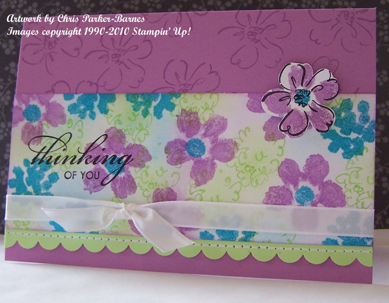
Stamp Sets: Heartfelt Thanks, Three Thoughts.

Cardstock: Whisper White, Gable Green, Orchid Opulence.

Inks: Basic Black, Orchid Opulence, Gable Green, Tempting Turquoise.

Accessories: Scallop Edge Punch, Paper piercing tool and Mat Pack, White Gel Pen, Whisper White Taffeta Ribbon, Paper snips, sponges.

The idea for the colour combination came from a recent post on Gretchen Barron’s blog.  It is not a combination I would have thought of, but it is stunning, and I will definitely be using more bold bright combinations in my cards from now on.  So, thank you for the inspiration Gretchen.

I am sure we all have stamp sets that are sitting up the back of the cupboard, unused and collecting dust.  So set yourself a challenge to get one of them out, and stamp with it again.  Stampin’ Up!bring us so many new, gorgeous sets, that sometimes it is easy to forget about some of the old favourites.
Here’s to more stamping time,
Chris

Emma – Cinema Saturday Creative Challenge #19

I am a huge fan of everything Jane Austin – I own all of her novels and have watched the movies based on those novels, some of them more times than I could possibly count!  So this week’s  Cinema Saturday Challenge gave me yet another excuse to watch Emma (not that I need an excuse, really) and all of a sudden my 3 year old son, Jamie, wants to watch Emma too.  Every day, in fact! 🙂   So why do I love Jane Austin so much?  I think it is the subtleties that are interwoven into the story lines, the relationships between the characters and the way she develops her story lines.  The sometimes subtle, and sometimes not so subtle, humour, and wit, as well as the scenery, the gorgeous clothes, and the sumtuous colours that are indicitive of the times.

This weeks card is inspired by one of my favourite scenes in the movie (well, there are quite a few of them that are favourites actually) where Emma is trying not to think of Mr Nightley, but in reality can’t stop thinking about him – hence the greeting “Thinking of You”.  The colours I chose for this card are also the colours worn on a number of occasions by Mr Nightley in the Gwyneth Paltrow version of the movie.  He wears a waistcoat of very similar material to my background paper, in the scene where he and Emma are shooting arrows and arguing over Harriet Smith’s refusal of Mr Martin.

Stamp Sets: Three Thoughts (from the Simply Sent Kit)

Cardstock: Very Vanilla, DSP Apple Cider (2008 Spring Mini Catalogue)

Inks: Close to Cocoa ink & marker, Chocolate Chip marker.

Accessories: Piercing Tool & Mat Pack, Scallop Edge Punch, Flower and Pearl from the Pretties Kit, Sponge, Markers, Chocolate Chip Grosgrain Ribbon, Caramel Gingham Ribbon.


Artwork copyright Chris Parker-Barnes

Images copyright 1990 – 2009 Stampin’ Up!

One Layout, Four Cards!

This evening saw the start of a new series of cardmaking classes, which I run here in my home.  And similarly to last term, we had a lovely evening of chatting, stamping, cardmaking and mess-making 🙂 

And of course, I just had to use Designer Series Papers in my layouts for the cards we made, another of my “favourites” Spring Flowers (they are all my favourites, just one more so on one day, and the next day it’s another…:) )  I used a nice simple layout and just changed the colours around and we have four totally different cards.  So if you missed out on tonight’s class, but would like to join in the fun, it is not too late but you need to contact me asap.  Here’s what you missed out on…..

Stamp Sets: Simple Delights, Carte Postale, Three Thoughts.

Cardstock: Very Vanilla, Chocolate Chip, Barely Banana.

Inks: Chocolate Chip, Always Artichoke, DSP Spring Flowers.

Accessories: Corner Rounder, Scallop Edge Punch, Vintage Brads, Double Stitched Ribbon in Groovy Guava, Taffeta Ribbon in Very Vanilla and Kraft.

Artwork by Chris Parker-Barnes

Images Copyright 1990-2009 Stampin’ Up!

Uncertain Times

I found an article on our Stampin’ Up! demonstrator website today about how, in these uncertain times, many people are turning to handmade gifts, cards, tags and wrapping.  With people trying to simplify their lives and keep as much money in their pockets as possible, many are turning to projects they can make in their own homes instead of finding entertainment outside the home.  So why not join the trend?  Do you have a cupboard full of photos that you would like to organise and put into a scrapbook?  I run classes in both card making and scrapbooking, and can also show you how to make boxes, bags……… pretty much anything you want to make 🙂  I also offer free introductory workshops in your home, where I can show you and a group of your friends just how easy and cost effective it can be for you to make your own cards and gifts for your loved ones.  Please contact me on 02 62597412 or 0408639475 or send me an email at doug_chris@myacn.net.au if you have any questions or would like to book in for a class or workshop.

So, on that note, here is a card I made today to send to my father-in-law in Tasmania for his birthday later this week.  I was feeling really uninspired about making a card for a man, so did a bit of blog surfing, and came across a card that I thought was perfect on Larisa’s blog, so I CASED it! 🙂  Hope you don’t mind, Larisa.  The colours are great for a male card, and all from the Earth Elements colour range. (Contact me if you would like more information on Stampin’ Up!’s clever colour combinations).

Stamp Sets:  Weathered, In The Spotlight, Three Thoughts.

Cardstock: Chocolate Chip, Creamy Caramel.

Inks: Chocolate Chip, Summer Sun, More Mustard, Really Rust, Ruby Red, Creamy Caramel.

Accessories: Sponge, Markers, Piercing Tool, Scallop Punch, Scallop Circle Punch, Circle Punch, Vintage Brads.

Artwork by Chris Parker-Barnes

Images copyright 1990 – 2009  Stampin’ Up!

Wallpaper Card!

I’m not sure why it is, but I have a real “thing” for some of the papers that look like old fashioned wallpaper.  Which is kind of odd considering that we are just in the process of stripping it off the walls of our new home, so that we can paint!  But I really do love just about all of the Stampin’ Up! Designer Series Papers, gorgeous colours and patterns, and I seem to find myself constantly drawn to them for both cards and scrap pages. 

So today’s card uses… yep, you guessed it, one of those old fashioned wallpaper designs 🙂  The layout and colours in the card is inspired by a similar card made by one of my favourite stamp artists Lin Mei Yap

 I have used one of four Limited Edition Stamp Sets available through the Sale-a-bration promotion at the moment, so if you like it and want one, please contact me to find out how you can get one.

Stamp Sets: Botanical Blooms, Three Thoughts

Cardstock: Soft Sky, Whisper White, Designer Series Paper Afternoon Tea.

Inks: Chocolate Chip, Soft Sky, Cameo Coral, Old Olive.

Accessories: Scallop Edge Punch, Sponge, Chocolate Chip Grosgrain Ribbon.


Artwork by Chris Parker-Barnes

Images  Copyright 1990-2009 Stampin’ Up!

I feel Pretty….

Something new and different again today, I used my markers to colour the big flower from the pretties kit, which is something I have seen done but never tried.  It is so effective and makes it really easy to colour the flower to match (or contrast) and also easy to blend more than one colour onto the flower.  It certainly makes a statement!! 🙂

Stamp Sets: Bodacious Bouquet, Three Thoughts, One of a Kind, Bodacious Jumbo Wheel

Cardstock: Pretty In Pink, Whisper White, Lavender Lace

Inks: Versamark, Pixie Pink, Orchid Opulence, Handsome Hunter

Accessories:  Large Flower and Large White Halfback Pearl from the Pretties Kit, Corner Rounder Punch, Markers, Glue Dots.

Artwork by Chris Parker-Barnes

Images copyright 1990 – 2008 Stampin’ Up!

Trying out new things :)

It’s been a rainy day in Canberra so far today (although now that I have said that, the sun has come out!) which makes it a really good day for sitting down and doing a little bit of experimenting with new things 🙂  I haven’t used much out of the pretties kit yet, and thought I would like to make a card or two today using some of the gorgeous beads and flowers.  For those of you who didn’t know, prior to becoming a Stampin’ Up! demonstrator, I ran a business making beaded jewellery, and still enjoy that in my spare (??????) time!  So combining the two things, papercraft and beading, is something I would like to try more of, and this is as good a way as any to start.

This card didn’t turn out anything like what I had planned 🙂 but is lovely and old fashioned and I really enjoyed making it.  The flowers on the pale plum card are stamped in silver ink, and then embossed straight onto the silver ink with clear embossing powder.  I didn’t use any versamark ink on them.  Like I said, today I am trying some things out! 🙂  I like the way the colours in the flowers are slightly varied, and I have taken a close up of them so hopefully you can see what I mean. 

Stamp Sets: Carte Postal, Three Thoughts

Cardstock: Perfect Plum, Pale Plum, Very Vanilla

Inks: Perfect Plum, Pale Plum, Sage Shadow, Encore Silver

Accessories: Markers, Pretties Kit (Hat Pin and Beads), Sponge, Clear Embossing Powder, Heat Tool,  Very Vanilla Taffeta Ribbon.

                                                                            Artwork by Chris Parker-Barnes

Images copyright 1990 – 2008 Stampin’ Up!

Purely Pomegranate

This colour has definitely become a favourite of mine, it goes with so many other colours, is great for Christmas, can be used for both male and female cards, and is just a beautiful shade of red.  Here I have put together black, white and purely pomegranate, a combination which is striking.  This card is for a niece of mine who isn’t into “girly” stuff, so I didn’t want to make it too flowery nor did I want to use pinks or purples, but I think this is a happy medium.

Stamp Set: Three Thoughts (from the Simply Sent card kit)

Cardstock: Basic Black, Whisper White, Purely Pomegranate, Designer Series Paper Rose Red.

Inks: Basic Black, Purely Pomegranate

Accessories: Purely Pomegranage Double Stitched Ribbon, Scallop Circle Punch, Horizontal Slot Punch, Sponge, Dimensionals, Glue Dots.

Artwork by Chris Parker-Barnes

Images copyright 1990 – 2008 Stampin’ Up!

I will do my best to continue to stamp and also to post some updates occasionally through the coming weeks, I just can’t promise that it will be very often with the move to our new house fast approaching 🙂

In the mean time, happy stamping 🙂

Chris