Clean and Simple Kitchen

No, I am not asking you to go clean up your kitchen, it is this week’s challenge theme at Our Creative Corner.  Meihsia’s challenge is to create a Clean and Simple card featuring something you would see in the kitchen.

I have used the coffee cup from the fantastic Scentsational Season stamp set (page 16 Holiday Catalogue), and while this is definitely meant to be a Christmas set, I didn’t want to make a Christmas card this time, so I punched out the For You sentiment from the Mixed Medley stamp set, one of the new Hostess Sets in the Holiday Catalogue, and layered that over the snowflake image.  The image is cut using the matching dies, which can be bought in a bundle with the stamp set.
The patterned paper is from the Festival of Prints Designer Series Paper Stack, and also the woodgrain is from the Natural Composition Specialty papers.

So please join in this week, we always love to see what you come up with for our challenges.  The rest of the projects from the Design Team can be seen here.

Happy Stamping!
Chris

The Tango

There are some colours within the Stampin’ Up! colour families that I don’t often use, most of them seem to be yellows and oranges, so I took this week’s Dynamic Duos Challenge of using the colours Tangerine Tango and Old Olive.  Now, Old Olive is a long time favourite, but combining it with Tangerine  Tango, hmmmm.
But I am glad I had a go at this one, I am pleased with how it turned out and think I may be using this colour a little more from now on.
The image is from the Serene Silhouettes stamp set, which has been coloured with markers.  And I have used the Two Tags die and the Apothecary Accents Framelits, both very useful and versatile.


I hope this inspires you to have a go at using a different colour combination.
Happy stamping!
Chris

OCC Sketch Challenge

This week it is my turn to set and host the challenge at Our Creative Corner, and I have chosen a sketch challenge for you for this week.  I would like you to make a card for a male using the sketch, and an extra but optional challenge for you, if you choose to accept it, is to use a Monochromatic colour scheme.
The zebras on my card are from the Zoo Review stamp set and have been watercoloured, then one has been cut out and raised and layered over the other.  I have used a masking technique for the sun – I punched out a circle of Post-It Note and then sponged around the circle using a sponge dauber.  The tree has been double stamped with two different colours of ink to give it that shimmery look.
The background paper is from the Howlstooth & Scaringbone DSP (patterned papers), and the strips of Cajun Craze card stock have been run through the Big Shot using the Woodgrain Embossing Folder.
The colours I have used are So Saffron, More Mustard, Cajun Craze and Early Espresso.

So, here is the sketch for you to use for your own card.

 Make it as simple or as complicated as you want, we would love to see what you come up with. And make sure you check out the inspiration from the rest of the Design Team.
Happy Stamping!
Chris

Another Blog Hop!!

Hope that you’ve all been enjoying the gorgeousness of the Stampin’ Up! Annual Catalogue.  The Holiday Catalogue also went live on the 1st of September, but we thought we’d give you a couple of weeks to get into it before we bombarded you with the beautiful things the Holiday Catalogue brings!!!

So another Artful Stampers Hop ~ this time to celebrate the Holiday Catalogue Launch!

You may have hopped here from Melissa at Bee Devine Designs, but if you are just starting here, keep hopping on through.  I’m stop 4 on the Hop and I’m glad you’re here sharing in the fun!!There are lots of gorgeous Christmas goodies in the Holiday Catalogue, but I thought I would showcase something different.  So, my projects for today all use the Orchard Harvest suite on pages 28-30 of the Holiday

Catalogue.  I am making these for my sister, who has a property with heaps of apple trees.  Eventually they want to open a cidery, so I thought I should keep her inspired with these gifts.  She doesn’t spend much time on her computer, so here’s hoping she won’t check out my blog and see them before she gets them!!I have used the Orchard Harvest patterned papers and the Perfectly Preserved Stamp Set for the card and the cute little box.  The box also uses the Cannery Set Framelits Dies which match the Perfectly Preserved stamp set.  Love how Stampin’ Up! match everything up.  These also come as a bundle to save you even more money!  Love it!
And I have made a Lavender Bag and Coaster, both of which use the Orchard Harvest Designer Fabric. Unfortunately the fabrics didn’t have apples on them, so I had to use pears instead!
I have a few other things to make to add to this collection, but I have been away for the last few days so haven’t had a chance to get it all done.  But I’ll share them all with you before I send them off to my sister.

Now it’s time to visit Anna for the next stop on our Hop. I am sure you will find lots of wonderful ideas to inspire you. And in case you get lost or there are broken links just pop back here for the full list of stampers taking part in this hop.

Don’t forget to leave comment love as you trip along the hop from blog to blog. We like to know what you think about the things we’ve been doing!!  And if you have any questions please feel free to send me an email.

Happy stamping, and I hope you find lots to inspire you!
Chris

Blog Hop links:

Alisa Tilsner
Madonna Dunn
Melissa Davies
Christina Barnes (you’re here!)
Anna from My Little Creative Nook
Alison Barclay
Nicole Derendorf
Kay Koufalakis
Karlie from Stamping with Karlie
Tina Hewett
Michelle Bartholomaeus
Kathryn Carr

Fundraising

Recently, I was asked to donate some boxed sets of cards for a charity fundraising event. I am very excited to be asked to do this, and wanted to make the box something a bit special, and I found this design on Tanya Bell‘s blog, and thought it was perfect. Thanks for sharing the tutorial for this one Tanya.

The white flap of the box opens up so that you can put the cards and envelopes inside.
For this particular box I have used Primrose Petals as the main colour, along with the Apothecary Art Stamp Set, the Framelits Labels Collection and some retired bits and pieces.  I have made two of these boxes and each has 6 of my hand crafted cards in it.
As well as that, I have also put together 250 advertising packs, each with information about my stamping business and each also has a gift tag inside.  I will show you the advertising packs in another post, but let’s just say it has definitely been a big project!
Hope you are having a crafty day.  Happy Stamping!
Chris

Artful Stampers Blog Hop

It’s time for the new Stampin’ Up! Annual Catalogue!!!  To celebrate, some of our Team – The Artful Stampers – are sharing fabulous projects showcasing a selection of the gorgeous new products available in the 2012-2013 Catalogue!!

You may have hopped here from Melissa at Bee Devine Designs Blog.  I’m stop 4 on the Hop and I’m glad you “hopped” in. 🙂  But if you started here, that’s ok too, just keep on hopping and you’ll eventually get all the way around!

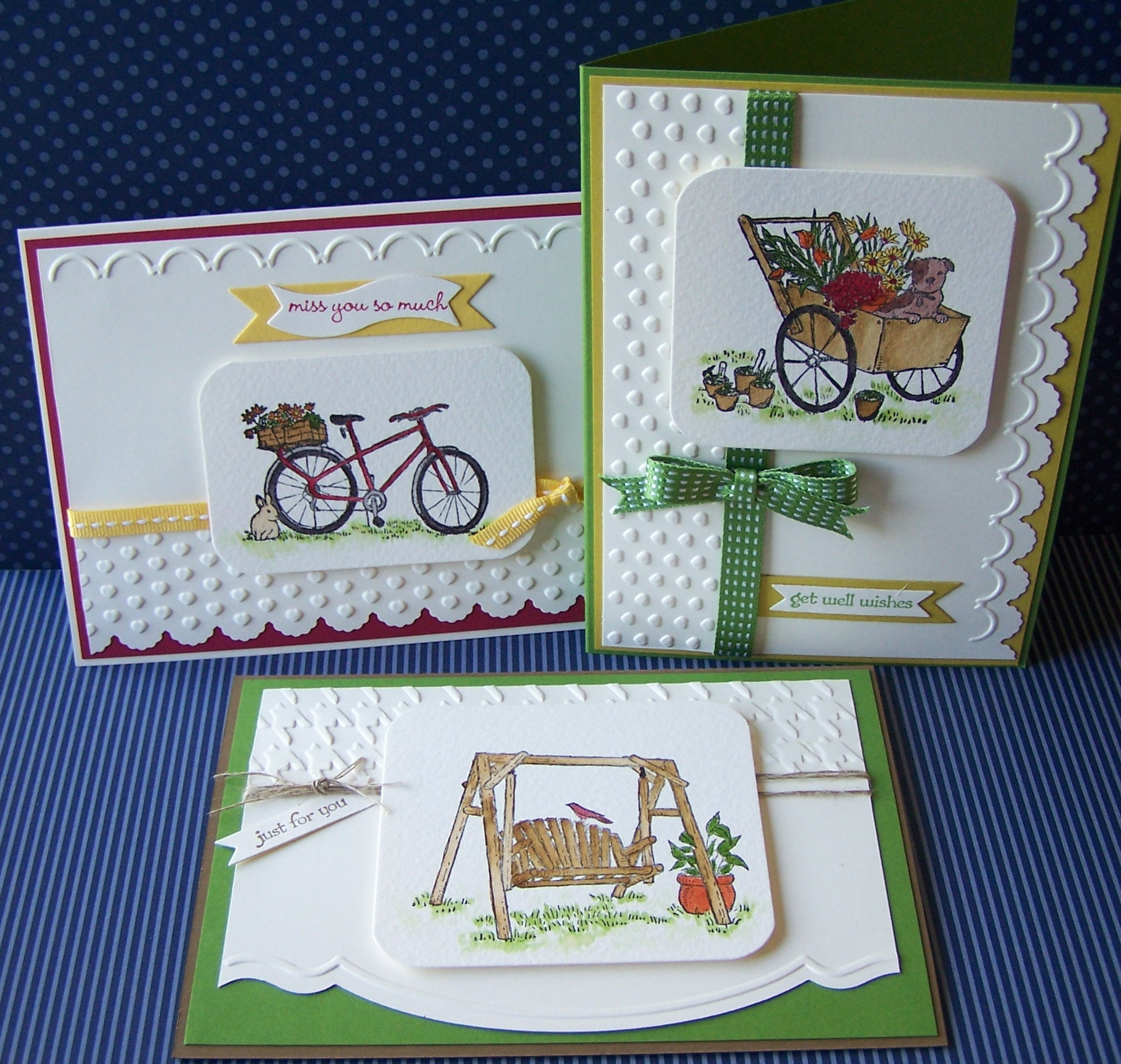
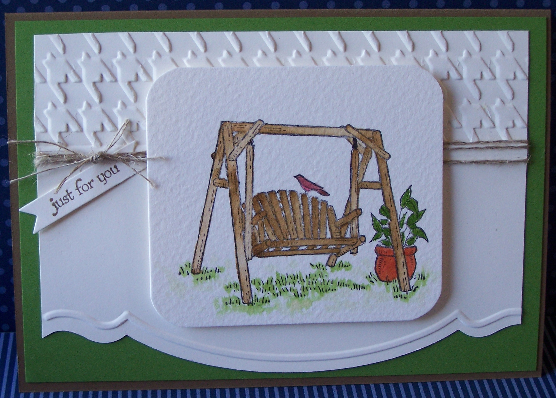
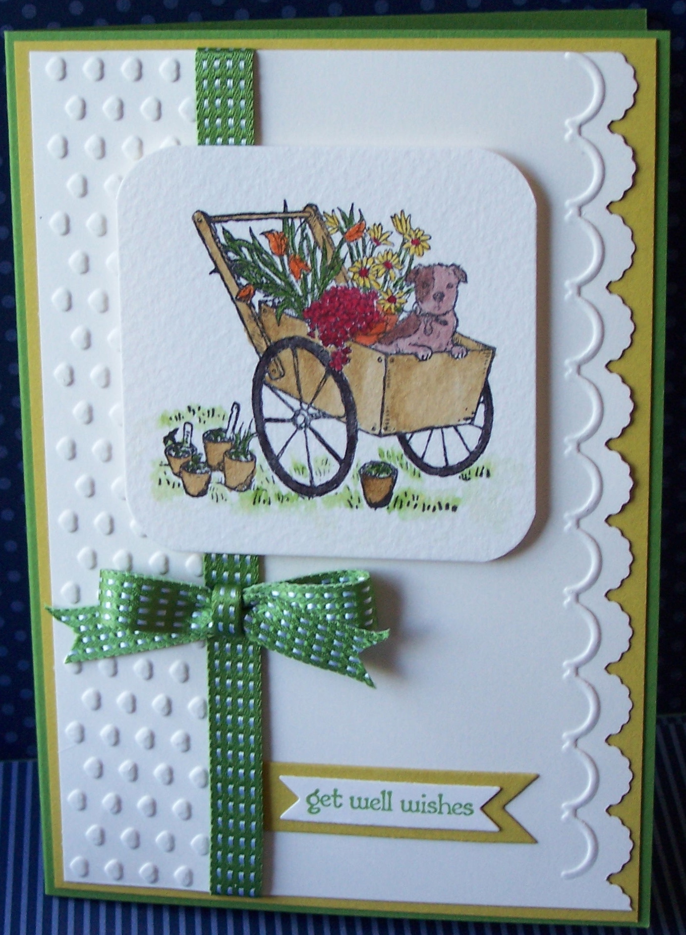
Today I am going to share with you a set of three cards made with a gorgeous new Hostess Set called Summer Afternoon (Page 201 of the new Catalogue).
The cards also feature a  new set of framelits dies called Bitty Banners (Page 191) and some of the new ribbons available, the Stitched Satin Ribbon and Stitched Grosgrain Ribbon (Page 172), and some of the new In Colours.

I have used inks and Aqua brush for the water colouring on each card, on watercolour paper, and have also used a combination of the Adorning Accents Embossing Folders, and the Adorning Accents Edgelits dies.

I will give you a closer look at each card individually, so that you can see them in more detail.

The colours for this first card are Gumball Green (new In Colour) and  Soft Suede, along with a touch of Cajun Craze for the pot.  The Houndstooth Embossing Folder along the top section adds some texture and I have wrapped some Linen Thread around a few times.

The second card has a layer of Raspberry Ripple (another new In Colour) card stock with some Daffodil Delight Stitched Grosgrain Ribbon.

And the third card…. ah… here is something for you to discover… a bit of a challenge…  this particular card uses the layout of a card from the new Annual Catalogue.  The first person (only  people who are not SU demonstrators please) to correctly tell me which page the card is on that inspired my card, and the stamp set and colours used in the card in the catalogue, will receive a small gift from me.  So leave me a message with your answers 🙂

As for my card, it uses Gumball Green and Summer Starfruit.  I am still not sure if I like Summer Starfruit, but I suspect it will grow on me, and if not, it will one of the very few SU colours that doesn’t appeal to me!
The card also uses Gumball Green Stitched Satin Ribbon.  The ribbons are lovely to work with!

Now click on the link to Kathryn Carr for the next stop on our Hop. I am sure you will find lots of wonderful ideas to inspire you. And in case you get lost or there are broken links just pop back here for the full list of stampers taking part in this hop.

 Thank you for visiting and if you’d like to leave a comment I’d be very pleased to hear what you think of the new catalogue and products 🙂

Happy Stamping!
Chris

  1. Alisa Tilsner
  2. Madonna Dunn
  3. Melissa Davies –  Bee Devine Designs
  4. Christina Barnes (oh, that’s me!)
  5. Kathryn Carr
  6. Anna – My Little Creative Nook
  7. Alison Barclay
  8. Michelle Bartholomaeus
  9. Nicole Derendorf 
  10.  Kay Koufalakis
  11.  Stamping With Karlie
  12.  Carolyn Bennie
  13. Tamsin Adams
  14. Tina Hewett

Layered Labels

Only two more days until the new Stampin’ Up! Annual Catalogue goes live to you.  And today I am going to give you a look at some more gorgeous goodies that will soon be available.  The colours I have used are Early Espresso, Pink Pirouette and Very Vanilla, and a new stamp set called Layered Labels.  I have stamped in Early Espresso and then coloured inside using a Pink Pirouette marker.  The image has been cut out using the new Apothecary Accents Framelits, and the brown layer with the Top Note Die.  The vanilla and brown layers have both been run through the Big Shot using a new Embossing Folder called Lacy Brocade.  Very lovely and lacey! 🙂
That layer of brown card stock is another new product being introduced into the catalogue, it is called Core’dinations Card Stock, and it is a sandable card stock, great for distressing, sanding or tearing.  Looks great, don’t you think?  It is available in Early Espresso (used here), Cherry Cobbler and Gumball Green (a new In Colour).  It also comes with a sanding system and dust buddy.
Now, this card was CASEd from another demonstrator… somewhere…. again, I apologise, but I can’t remember where I saw it.  I often do a quick blog hop and have a look at a few sites to get some inspiration, but I usually get ideas and then go and do something else.  So, please let me know if you recognise it, but as always, I imaging mine has ended up being fairly different.  Anyway, I hope you like it.
And talking about Blog Hops, make sure you come back here on the morning of the 1st Sept for a Blog Hop through some fellow Stampin’ Up! demonstrators blogs, to see lots of new ideas from the catalogue.  In the meantime,
Happy Stamping!
Chris

Recycle It… With a Pop of Green!

Another really great challenge this week at Our Creative Corner.

So, what did I recycle?
Well, I had an old tin that originally had some yummy chai tea in it, and I didn’t want to throw away the tin once the tea had been used, but didn’t quite know what to do with it.  But it has had a makeover and now holds my paper clips!
So the tin has been recycled for a new use, and I have used some denim from the pair of my son’s old jeans that I started cutting up a few weeks ago!
Actually I think I have also “recycled” some of the recent challenges as well 🙂 – last week’s challenge was to use some office supplies (check – there is a paper clip on the lid), and the previous week was to use denim (check).
I have also used the very yummy Twitterpated patterned papers, and a tiny bit of the new Comfort Cafe patterned papers, just poking out from under the denim.  And of course, those butterflies… the top two layers use the Beautiful Wings Embosslits, and the larger blue butterfly is the Beautiful Butterflies Bigz Die, through the Big Shot.
Check out what the rest of the Design Team have made for this challenge, and if you have any questions about this project, feel free to send me an email.
Happy stamping!
Chris

Wedding Stationery

Just a quick post tonight, some of you will have noticed a new button on my blog for Special Occasions, and it is so that I can share my Wedding and Special Occasions designs with you.
I’ll be sharing more of these as the samples are finished, and I’ll also have them in an album to take to markets so that you can see them in real life.

I’ll be back with some stamping tomorrow.
Chris

OCC Sparkly Stuff Challenge!

“Sparkly Stuff” – you know, rhinestones, glitter… 🙂

This week’s challenge comes from Paula McClane at Scrap Addict’s Attic.

So this is Paula here, one of the newbies to the Design Team, I’m so excited to be on the team!  Let’s get to it then, my first challenge! I am not a girly girl, I’m mostly found wearing a tee shirt and capris or jeans.  But sometimes you just gotta whip out the shiny sparkly stuff & make it dazzle! Use rhinestones, stickles, glitter, etc along with items found in nature (plants, animals, etc)!  A bit of bling mixed with nature..”

Well, who doesn’t like a bit of bling?
This card was inspired by one I saw… well, somewhere!  There are so many ways to get inspiration these days that it gets difficult to know where you saw things…

Anyway, I have used the Shaving Cream technique to colour some white card stock. I haven’t used this techniques for a long time and thought it would be fun to give it a go again.  My son had fun too! 🙂
Butterflies have then been cut out using the Beautiful Wings Embosslit Die, through the Big Shot.  And I admit that some of the Rhinestone bling is not from Stampin’ Up!  You could, however, use the clear rhinestones and colour them using a Sharpie or other permanent marker, in the colours you want.
Another fun challenge, so I hope you play along with us this week.  Check out what my fellow Design Team members have created for this challenge.  Now there’s some inspiration!
Get out your glitter and rhinestones and anything else that qualifies as bling! And happy stamping!
Chris