Pop-up Posies


I love the colours in this card, so pretty!
This particular card was inspired by a very talented fellow Stampin’ Up! demonstrator Christine Blain from Happy Heart Cards.  As usual, I have changed things around to what works for me, but the basic idea is similar to Christine’s card.
The beautiful papers are from the Tea for Two DSP, and I have used Needlepoint Border embossing folders to create the little scallop and stitch feature through the middle.  The flower, tag and the stamp all come from the Pop-Up Posies Designer Kit, which is very versatile, and makes it so easy to create a gorgeous gift tag, or add the tag to a card as I have done here.
Send me an email if you would like to purchase one of these kits, they make creating soooooo easy! 🙂
Happy stamping!
Chris

Easter Bunny is coming…..

….so I thought I had better get on and make some Easter cards.
Again, I have used the Oval Framelits along with the very cute Everybunny stamp set – too cute!
I am a bit addicted to banners and flags on my cards at the moment, so I have used the gorgeous Tea For Two Designer Series Papers to create them here, and some brads to “secure” them at the top.  Little bunny has been heat embossed using black embossing powder and then coloured using inks and a blender pen.
You can contact me if you would like more information about any of the products I have used for this card, and since Easter is less than a month away, contact me also to order your Easter stamps and papers now so that you have some time to create something special for someone special! 🙂
Hope you have a crafty weekend.  Happy Stamping!
Chris

Oval Framelits

I have to apologise for my lack of posts recently, things have been rather busy in our household.  I have been doing a little crafting so I will try to catch up and share some of them with you.
Today I will share a card that I made using the new Oval Framelits.  I just love oval shapes, especially on cards, but have only just had the chance to try them out.  Need a few more hours in the day, I feel.  Or perhaps I just need to sleep less 🙂

This card uses the Everything Eleanor, Papillon Potpourri and Apothecary Art stamp sets, along with the colours Bashful Blue and Midnight Muse and a half of one of the pretty doilies.

Promise to be back soon with more of my creations.
Happy stamping!
Chris

Dynamic Duos #41

This week’s Dynamic Duo‘s colours are:

Yum… another gorgeous combination!
The colour reminds of a beautiful clear ocean, so I made my card using the new By The Tide stamp set.

I have also used the French Foliage set to add some “bubbles” in the background along with the Square Lattice embossing folder and some sponging around the edges, and paper piercing and faux stitching of course! 🙂

You can see what the rest of the Design Team have done with these colours here.  Please join us and share your wonderful creations.
Happy stamping!
Chris


Bright Blossoms

This is one of “those” stamp sets… you know the ones, you see it, imagine all the great things you could do with it, and then don’t use it!  Yes, for me Bright Blossoms has sat on the shelf for quite some time, unused and unloved.
But… I received a package in the mail during the week with some bits and pieces for a challenge, and amongst it, some patterned paper from the Summer Smooches DSP – one that I don’t yet own.  So, perfect opportunity to get Bright Blossoms off the shelf and use it!


Ok, so my challenge was to use the colours in the card stock I had been sent, which were Real Red, Tempting Turquoise and Island Indigo, add some whisper White card stock if needed, use only the ribbon included along with one other type of embellishment, which in this case is the rhinestones (must have bling!).
I have some the patterned paper left over now, so I might just have to work out how to use it for another card.  You never know, Bright Blossoms might get a bit more of a work out! 🙂
Hope you are having a crafty weekend.  Happy stamping!
Chris


Dynamic Duos #37

More Masculine cards from me again today!  I thought the colours would lend themselves nicely to masculine cards, but then I have seen all the beautiful flowery cards from some of the other Design Team members…… just gorgeous!  Make sure you check them out here.

I started off just making one card, using the Dapper Dad stamp set, (which will be available from the 1st Feb ), and then thought I may as well make a set of matching cards.

Here they are individually, so that you can see them in more detail.


In my previous post, I started on some tips for making masculine cards.  So here is another one… I guess this might be obvious from the cards I have made here, dry embossing (using Textured Impressions Embossing folders) make great backgrounds for masculine cards, giving lots of texture and interest.  Great ones to keep in mind are the one I have used here, which is the Argyle, Square Lattice, Houndstooth, Perfect Polka Dots, Woodgrain (one of my favourites!), Chevron, Stripes, and definitely Spider Web.  You can change the entire look of a card just by using a different embossing folder in the background.  Give it a try and see what you like best.
You’ll be pleased to hear that there are more great embossing folders coming in the new Seasonal Catalogue – Cloudy Day, and Honeycomb, both of which would work just fine on a masculine card (available from Feb 1st).

I do hope you will join us this week with this gorgeous colour challenge, we love to see what you have come up with, so make sure you share your work with us 🙂
Happy Stamping!
Chris

Feeling Sentimental

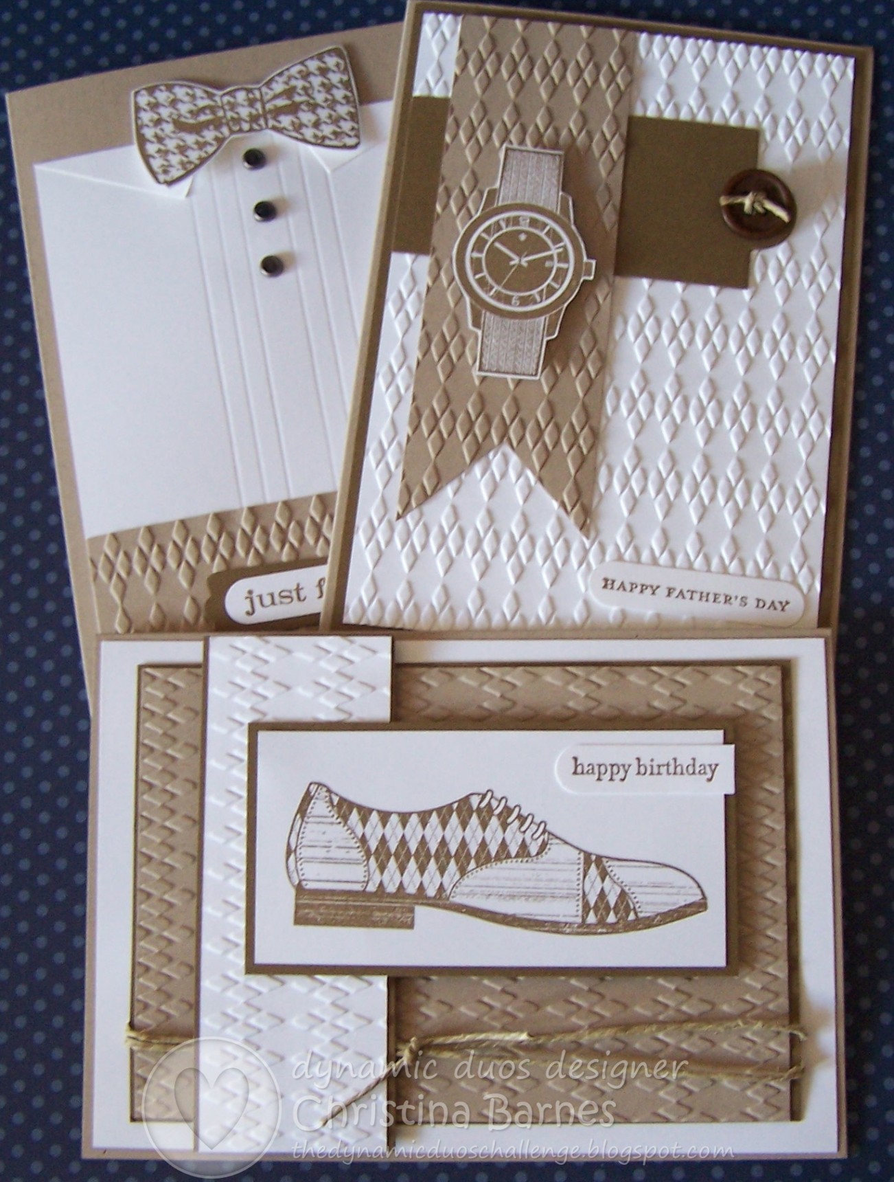
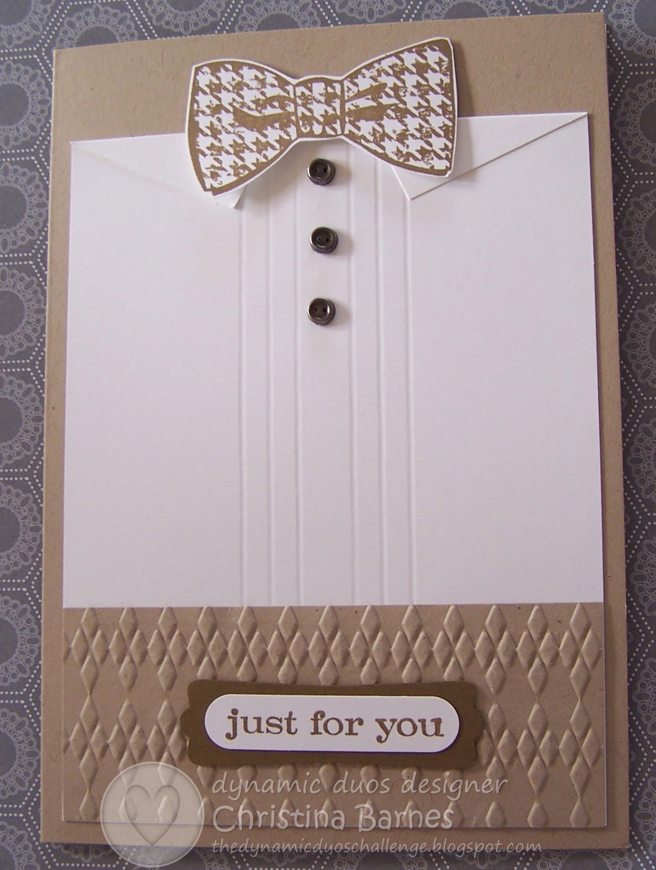
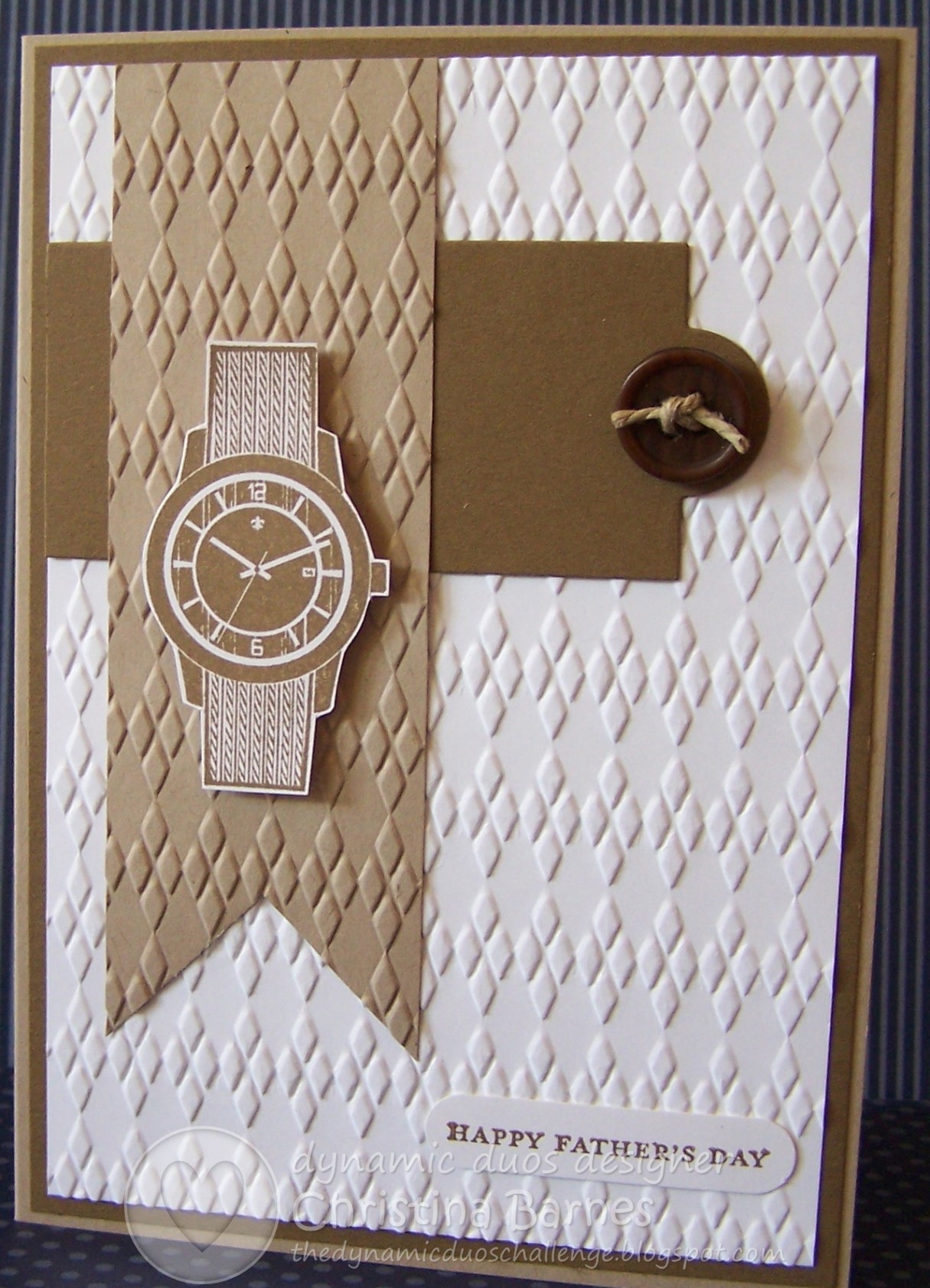
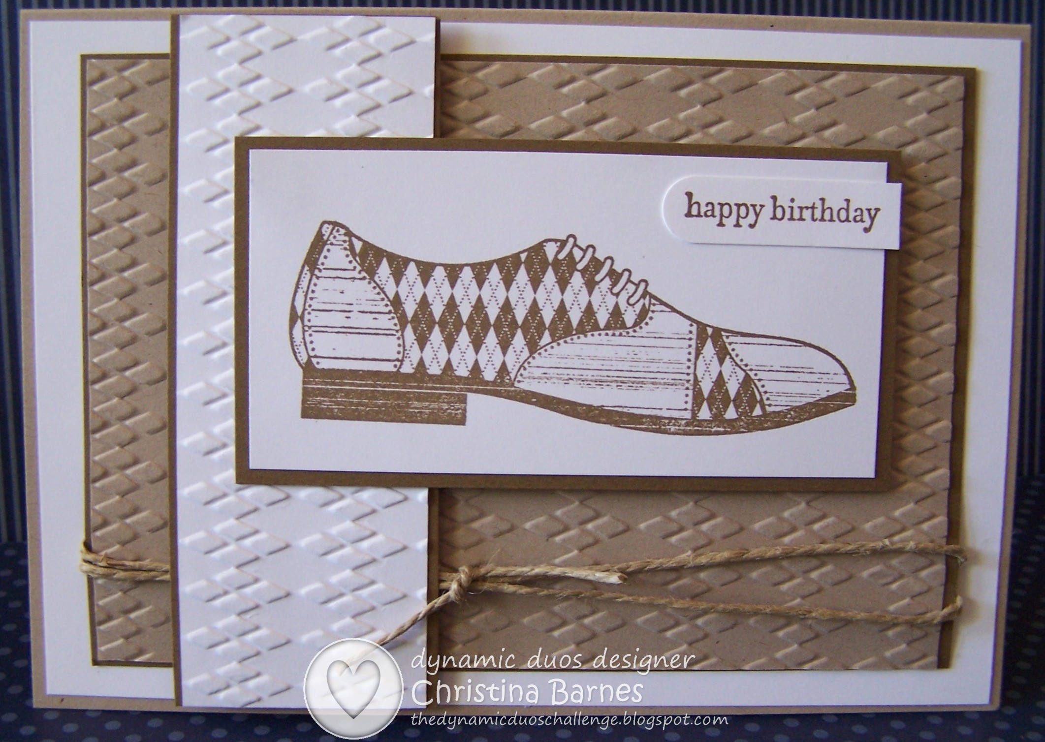
I’ll be the first to admit that I love making cards that are girly – pinks, purples, ribbons, lace and vintage in style, but I also really enjoy making masculine cards.
A lot of people have commented that they struggle with making cards for the men in their lives, so this year I plan to share with you lots of tips and ideas for male cards, and hopefully some inspiration too 🙂

This particular card uses the new Sale-a-Bration stamp set called Feeling Sentimental, and it is great for masculine cards.  I am also going to enter this card in this week’s Paper Players challenge #129, which is a sketch challenge.  Pop on over to their site, lots of inspiration for you!

So, my first tip for making masculine cards is, don’t be afraid to use patterned papers, as I have done in this card.  I have used the Howlstooth & Scaringbone DSP here, which is perfect, but don’t forget to look at the packs of papers you already have.  Stampin’ Up! are fabulous when it comes to incorporating all sorts of possibilities, so have a look through those flowery papers and look for stripes, spots, even what may seem like a girlish pattern, could be cut so that it changes it’s look. How about some of those Christmas papers?  Red or green stripes or spots or patterns could easily be turned into a background for a tree or other masculine image.
Let’s see if I can give you an example…. The Twitterpated DSP is a lovely flowery, pretty pack of papers, but have a look at the reverse side of each paper.  Green and blue checks… stripes…. geometric designs in grey, and a red geometric pattern that could easily be cut to look masculine.

For my card, I have die cut the patterned paper using the Window Frames Collection, and then layered that over my stamped image.  This particular patterned paper is only available for a few more days, so make sure you get in quick if you want to get hold of some!

Happy Stamping!
Chris

Bright Birds

I love this technique, and how bright and cheery these cards have turned out!

These are really easy to make and so quick that you can easily make up a batch as a gift for someone.

These ones use the International Bizarre patterned papers and the For the Birds stamp set, and I have highlighted the colours Pacific Point and Tangerine Tango.  Of course, they would look great using any of the gorgeous Stampin’ Up! Designer Series Papers.

And because they are so quick and simple, I have had a request to run a class on this set of cards.  So instead of my Card Kit night on the 1st Feb, we will be making this cute set of cards.  Cost will be $15 and includes all materials, but do contact me asap to book your place as seats are limited.

Happy stamping!
Chris

Dynamic Duos #35

Gorgeous colours again this week for the Dynamic Duos challenge, and here is the third card in my Bordering on Romance set that I shared in my previous post.

I have used mostly So Saffron with just a hint of Certainly Celery on the leaves.

The sprays of flowers have been cut out by hand and then lifted off the card with dimensional tape.  And this time, instead of lots of faux stitching, I have just done lots of paper piercing 🙂 it does create a completely different effect.  The greeting is from the Perfectly Penned stamp set.

Lots of inspiration from the rest of the Design Team, which you can see here.
Hope you are having a crafty and productive weekend.  I know I am! 🙂
Happy stamping!
Chris


Melon Mambo and Island Indigo…

….sounds kind of exotic, doesn’t it?  I really like the names that Stampin’ Up! use for their colours, and I like the combination of colours for this week’s Dynamic Duos challenge too!

DD# 34

I had too many ideas for this combination, so in the end I decided to keep it simple.

I have used the flower from Button Buddies stamp set and fussy cut them to create the layers of different colours.  The greeting is from Wacky Wishes and I have used the zig zaggy background was created using the Chevron Embossing folder through the Big Shot.

Lots of inspiration from the rest of the Design Team again this week, so make sure you have a look here, and lets see what gorgeous designs you can come up with using these colours.
Have fun with it, and happy Stamping!

Chris