A Special Thank You and a Challenge!

Today’s card is meant as a very special thank you to a new group of friends.
I was lucky enough to attend seven amazing days of training, which now see’s me qualified as an NLP Practitioner.  And during those days, I got to know a group of amazing people, some of who have become good friends.  And so I want to thank each of them for their friendship, love and laughter.  Normally I would send them a card each, but there are a heap of them and I don’t know their addresses, so I will do it here instead! 🙂

We are always influencing and touching the people we come in contact with each day, either in a positive way, or a negative one.  And everyone of these amazing people has given me so much in a positive way, probably without even realising it.  If I miss anyone, please forgive me, but a special thanks to:  The very amazing Tad and Adriana James, Georgette, Cat, Paul, Julie, Leah, Margie, Anita and Les, Naomi, and all the other amazing people who I would have loved to get to know better.

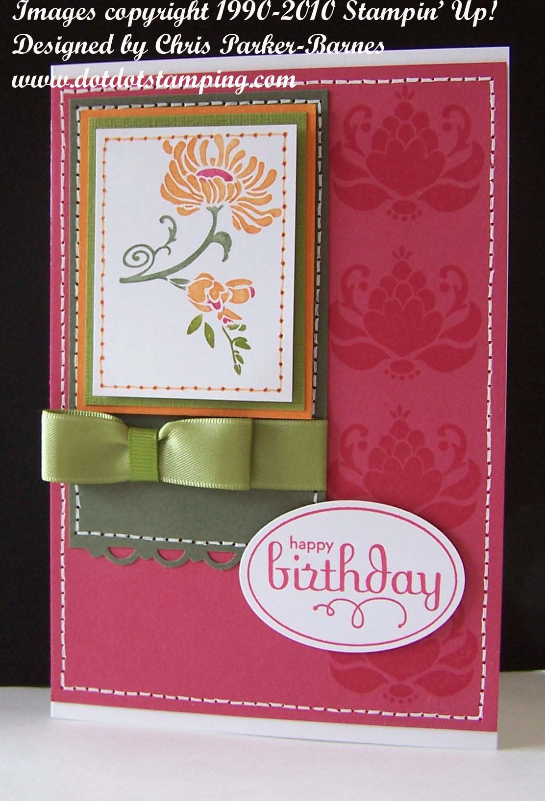
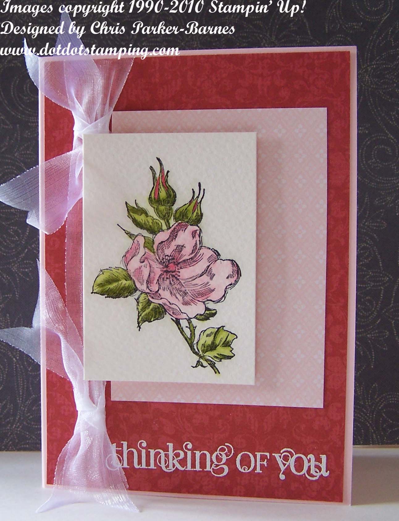
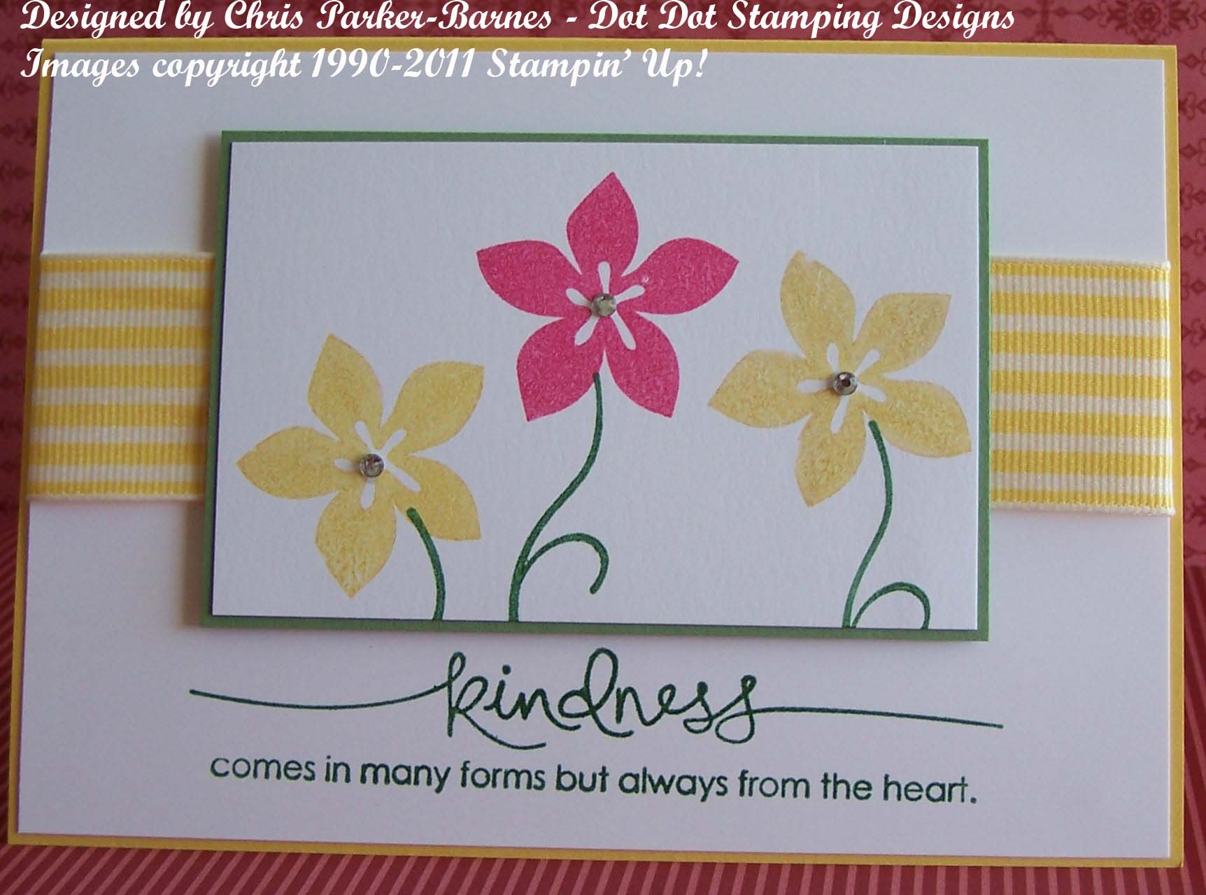
And now down to the business end…. the colour combination, came from a challenge set by the girls at Stampin’ Royalty.  The colours, Wild Wasabi, Melon Mambo and Daffodil Delight, just had to be flowers…… so I have used an old favourite –  Cottage Garden, and for the greeting, Heard from the Heart, both from Stampin’ Up!  Hope it brightens your day and reminds you that spring will be here…. sooner or later!

Happy Stampin’
Chris

Just Believe……

I love the saying on this card -“Some things have to be believed to be seen”.  I think I was trying to send a message to myself!
Yes, I have once again, been conspicuous in my absence, for which I apologise profusely, but which I can assure won’t be an ongoing thing.  All I will say is that the last six months, when added to the previous 6 or so, have been the most difficult of my life.  But onwards and upwards, I say! There are positive things now starting to happen in my life, including getting back into stamping.

Unfortunately, one of the things I had to let go of was being a Stampin’ Up! demonstrator.  But I will definitely be going back to that in around 6 months time when things are back on track.
In the meantime I will be using lots of the gorgeous stuff I have here and selling my cards at the school that Jamie goes to part time, to help them raise much needed funds.  And I will also be sharing my creations with you.
Have a wonderful crafty day!
Chris

Ink Embossing Class

Saturday 9th October at 1.30pm – if you would like to come along and make this card, you must contact me asap, as places are limited.

Cherry Cobbler is such a gorgeous rich red, and looks fantastic combined with Old Olive.  The photo doesn’t show just how gorgeous these colours look together.
This card also uses Perfect Punches Stamp Set, Scallop Circle punch, and the Petals-a-Plenty Embossing Folder and the Big Shot.

Happy Stamping,
Chris

Definitely a colour challenge!

Another challenge from Just Add Ink, this time a colour challenge, and wow, was it a challenge!  Definitely not colours I would normally put together – Rose Red, Old Olive, Pumpkin Pie and Always Artichoke.  Here is what I came up with:

The main flower image is from the set Friends Never Fade, and I have coloured it using markers.  The greeting is from the fantastic Perfect Punches set, which is a must from the new catalogue – very versatile and useful set.  I have used some of the gorgeous Satin Ribbon in Old Olive. And of course lots of my favourite, faux stitching! 🙂

I hope you are all having a fabulous long weekend, and getting lots of crafting done.
Happy stamping,
Chris

Two posts in one day!

What’s going on? 🙂
I liked the Just Add Ink sketch so much, and had some die cut butterflies left over from my previous card, so I just had to use them.  I’m really not sure if I like this card or not, but again, more new things to play with, so what more of an excuse does a girl need? 🙂

So, I have once again used the Sizzlits Beautiful Wings Die in the Big Shot, with some of the half backed Rhinestones this time.  I have run the white background through the Big Shot with the Finial Press Embossing Folder, then I have used my new Distressing kit to distress the edges and put the colour onto the top of the raised parts.  The patterned paper is from the Regals Designer Series Paper Packs, and the lovely lace is from my own stash.  I haven’t added a greeting to this card because I just didn’t know what to put on it, so left it blank for now. 
Let me know if you like it or not!
Chris

Just Add Ink #136

This  week’s Just Add Ink Challenge is a sketch challenge, which you can have a look at if you click on the link.   I had so many ideas for this sketch that I really didn’t know which one to start with.  But, lots of new goodies arrived on my doorstep today, and I had to play with the beautiful new stamp set called “Elements of Style”. Too gorgeous for words! Not sure that I am happy with my watercolouring – had a few too many interruptions, but I think it ended up ok.

I also have to apologise for the photo, we had a very dull, overcast afternoon here in Canberra, which wasn’t very good for taking photos.
Stamp Sets: Elements of Style, Silhouette Sentiments (Level 1 Hostess ).
Inks: Black Stazon, Wild Wasabi, Pear Pizzazz, Blushing Bride, Perfect Plum, Early Espresso.
Cardstock: Very Vanilla, Early Espresso, Blushing Bride, Watercolour Paper, Lap of Luxury DSP.
Accessories:Aquabrush, Very Vanilla Taffeta Ribbon, Beautiful Wings Embosslit Die and Big Shot, Half-back Pearls, Word Window Punch, Champagne Mist Shimmer Paint.

The second card today is a variation on the sketch, with a Christmas theme.  Nothing like being prepared for Christmas in advance!

This card uses Contempo Christmas and the greeting is from Heard from the Heart.  The colours are Old Olive and Riding Hood Red – I am a bit of a traditionalist when it comes to Christmas colours. 🙂
I have used the Big Shot with the Top Note Die, some retired DSP and Gold twine, and that’s pretty much it! Simple!

Happy stamping
Chris

Another day, another challenge!

Yes ok, I am really getting into the challenges at the moment, I am finding them a good way to keep on track with my card making.
Today’s card is for a sketch challenge from Our Creative Corner, and I have made another pretty, girly card, especially for a friend who is going through Chemo at the moment.  I hope it will cheer her up just a little and let her know that I really am thinking of her.

Stamp Sets: Happiness Shared, Curly Cute.
Inks: Versamark, Black Stazon, Markers in Old Olive, Pretty in Pink and Regal Rose.
Cardstock: Pink Pirouette, Watercolour paper, Retired DSP in Pink Pirouette and Riding Hood Red colours.
Accessories: White Embossing Powder, Heat Gun, Aqua Brush, Ribbon from my personal stash!

I have done the watercolouring by first putting some colour down using my markers, and then using the aqua brush to spread and blend the colours.  It’s not how I usually do watercolouring, but was easy to do and worked well.  But I do enjoy experimenting! 🙂
Happy stamping,
Chris

Just Add Sympathy

This week’s Just Add Ink challenge is to make a sympathy card.  And this really was quite a challenge for me.  As many of you know, my Mum passed away earlier this year, and I received some gorgeous sympathy cards from many of my stamping friends.  But I know how difficult it is to make one, even though, realistically, there isn’t a right or wrong sympathy card.
But with this challenge, I wanted to make a card that was fairly simple, ie not too many accessories, but that also gave the feeling of what it is like to lose someone very close to you.  That feeling of loneliness and emptiness, of a huge hole in your life and the knowledge that life will never be the same again.

I have used the Pendant Park Stamp Set, and while I really love the seat with the little squirrels on it, I thought it had more impact as just an empty seat.  I have also done some very light sponging using a reverse masking technique, for some background interest, but it looks better in real life than in the photo.

I am not sure if I have achieved what I wanted to with this card, but there is a poem that my husband read out at Mum’s funeral service that I would like to share with you, and hope my card come somewhere close to the feelings it invokes.
Have a great day and happy stamping
Chris

Do not stand at my grave and weep;
I am not there.  I do not sleep.
I am a thousand winds that blow.
I am the diamond glints on the snow.
I am the sunlight on ripened grain,
And I am the gentle Autumn rain.
When you awaken in the morning’s hush
I am the swift uplifting rush
Of quiet birds in circled flight.
I am the soft stars that shine at night.
So do not stand at my grave and cry.
I am not there.  I did not die.

Just Add Ink

I love the challenges that the talented girls over on Just Add Ink come up with, but just haven’t had much time in the past to do many of them, but I think it’s time that changed, don’t you? 🙂  Their challenge this week is to use the colour combination of So Saffron, Pretty in Pink, Certainly Celery and Crumb Cake (previously known as Kraft).  Well, these colours didn’t really inspired me very much, I am just not into the feminine, girly stuff at the moment (that could change at any given moment! 🙂 ). And after three or four attempts, none of which really seemed to be working the way I wanted them to, well, if in doubt, resort to knitting!  So I did.
But after I while I decided to use one of the failed attempts, changed it around somewhat, and here is the end result.

I have used the new Elegant Bouquet embossing folder for the flowers, and then coloured the raised parts using pastels (this was not the original idea, but seems to have worked out ok).  And I wanted to use the Petals-a-Plenty embossing folder for the Crumb Cake layer, but it hasn’t arrived yet, so had to use Perfect Polka Dots instead (but you can use your imagination and pretend). The butterfly is a stamp from the set For Everything.  The beautiful ribbon is unfortunately retired, but again, I am waiting for all my new ribbons to arrive.  The  little pink roses are just made from cardstock, and on the tag is the word “friends” from the Tiny Tags Stamp Set, and using the Jewellery Tag punch. Oh, and I nearly forgot the important part, Dazzling Diamonds (which is probably hard to see in the photo) on the butterfly and in the centre of the flowers and roses.
In the end, it was good fun to put it all together, and I hope you like it.
Happy stamping,
Chris

More yummy new stuff!

Today’s card uses one of the new embossing folders, called Elegant Lines.  Using embossing folders makes card making so quick and easy, and the new ones are, like everything else Stampin’ Up, absolutely gorgeous!
The cardstock colours I have used are Pear Pizzazz , then Concord Crush(both new In Colours), and Baja Breeze for the embossed layer.  Butterfly is stamped with Stazon and then coloured using Concord Crush and Blushing Bride markers, and again, more of those lovely pearls.

And don’t forget to book in for my Ink Embossing Class, if you would like to experiment with a different way of using the embossing folders.  Details are on my Classes page.

Hope you have all had a crafty weekend.
Happy stamping,
Chris