Two posts in one day!

What’s going on? 🙂
I liked the Just Add Ink sketch so much, and had some die cut butterflies left over from my previous card, so I just had to use them.  I’m really not sure if I like this card or not, but again, more new things to play with, so what more of an excuse does a girl need? 🙂

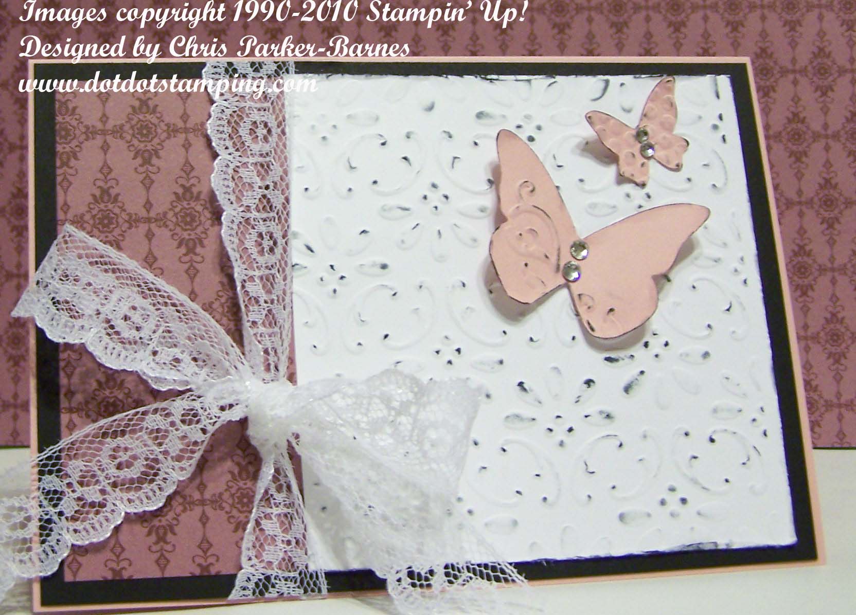
So, I have once again used the Sizzlits Beautiful Wings Die in the Big Shot, with some of the half backed Rhinestones this time.  I have run the white background through the Big Shot with the Finial Press Embossing Folder, then I have used my new Distressing kit to distress the edges and put the colour onto the top of the raised parts.  The patterned paper is from the Regals Designer Series Paper Packs, and the lovely lace is from my own stash.  I haven’t added a greeting to this card because I just didn’t know what to put on it, so left it blank for now. 
Let me know if you like it or not!
Chris

Just Add Ink #136

This  week’s Just Add Ink Challenge is a sketch challenge, which you can have a look at if you click on the link.   I had so many ideas for this sketch that I really didn’t know which one to start with.  But, lots of new goodies arrived on my doorstep today, and I had to play with the beautiful new stamp set called “Elements of Style”. Too gorgeous for words! Not sure that I am happy with my watercolouring – had a few too many interruptions, but I think it ended up ok.

I also have to apologise for the photo, we had a very dull, overcast afternoon here in Canberra, which wasn’t very good for taking photos.
Stamp Sets: Elements of Style, Silhouette Sentiments (Level 1 Hostess ).
Inks: Black Stazon, Wild Wasabi, Pear Pizzazz, Blushing Bride, Perfect Plum, Early Espresso.
Cardstock: Very Vanilla, Early Espresso, Blushing Bride, Watercolour Paper, Lap of Luxury DSP.
Accessories:Aquabrush, Very Vanilla Taffeta Ribbon, Beautiful Wings Embosslit Die and Big Shot, Half-back Pearls, Word Window Punch, Champagne Mist Shimmer Paint.

The second card today is a variation on the sketch, with a Christmas theme.  Nothing like being prepared for Christmas in advance!

This card uses Contempo Christmas and the greeting is from Heard from the Heart.  The colours are Old Olive and Riding Hood Red – I am a bit of a traditionalist when it comes to Christmas colours. 🙂
I have used the Big Shot with the Top Note Die, some retired DSP and Gold twine, and that’s pretty much it! Simple!

Happy stamping
Chris

Just Add Ink

I love the challenges that the talented girls over on Just Add Ink come up with, but just haven’t had much time in the past to do many of them, but I think it’s time that changed, don’t you? 🙂  Their challenge this week is to use the colour combination of So Saffron, Pretty in Pink, Certainly Celery and Crumb Cake (previously known as Kraft).  Well, these colours didn’t really inspired me very much, I am just not into the feminine, girly stuff at the moment (that could change at any given moment! 🙂 ). And after three or four attempts, none of which really seemed to be working the way I wanted them to, well, if in doubt, resort to knitting!  So I did.
But after I while I decided to use one of the failed attempts, changed it around somewhat, and here is the end result.

I have used the new Elegant Bouquet embossing folder for the flowers, and then coloured the raised parts using pastels (this was not the original idea, but seems to have worked out ok).  And I wanted to use the Petals-a-Plenty embossing folder for the Crumb Cake layer, but it hasn’t arrived yet, so had to use Perfect Polka Dots instead (but you can use your imagination and pretend). The butterfly is a stamp from the set For Everything.  The beautiful ribbon is unfortunately retired, but again, I am waiting for all my new ribbons to arrive.  The  little pink roses are just made from cardstock, and on the tag is the word “friends” from the Tiny Tags Stamp Set, and using the Jewellery Tag punch. Oh, and I nearly forgot the important part, Dazzling Diamonds (which is probably hard to see in the photo) on the butterfly and in the centre of the flowers and roses.
In the end, it was good fun to put it all together, and I hope you like it.
Happy stamping,
Chris

More yummy new stuff!

Today’s card uses one of the new embossing folders, called Elegant Lines.  Using embossing folders makes card making so quick and easy, and the new ones are, like everything else Stampin’ Up, absolutely gorgeous!
The cardstock colours I have used are Pear Pizzazz , then Concord Crush(both new In Colours), and Baja Breeze for the embossed layer.  Butterfly is stamped with Stazon and then coloured using Concord Crush and Blushing Bride markers, and again, more of those lovely pearls.

And don’t forget to book in for my Ink Embossing Class, if you would like to experiment with a different way of using the embossing folders.  Details are on my Classes page.

Hope you have all had a crafty weekend.
Happy stamping,
Chris

Fantastic Fabric Creative Challenge

Now that’s something a bit different!  I had to take part in this challenge as soon as I saw it – to use fabric in a project.  This particular challenge is from Shelli Gardner, the Co-founder and CEO of Stampin’ Up! who is such an amazing and inspiring person.  You can find Shelli’s challenges here, and make sure you click on some of the entries for lots of inspiration and ideas.
So, to the challenge.  We don’t have Stampin’ Up! fabrics here in Australia (yet!) so I have used some that was in my (rather large) stash of material.  Then I have used the Scallop Circle Die through the Big Shot with the layer of material, to cut it out.  I have then cut an arc out of each side to create the waist line of the dress, and some retired lace for the belt.

Now we get to some of the absolutely gorgeous new stuff from the new catalogue, which is full to overflowing with irresistable things.
I have used some of the new In Colours and DSP, namely Blushing Bride and Concorde Crush Cardstock and the Lap of Luxury DSP.  I have used the Happiness Shared Stamp Set (Page 80) for the greeting and the rose bud, which is watercoloured using Blushing Bride ink with a little Regal Rose to add to some depth, and Pear Pizzazz (another In Colour) for the leaves.  You will also notice some of the half back pearls, which are now available in packs of 150 (50 of three different sizes), much to my delight! (See Page 140 of the catalogue).  But what you can’t really see in the photo is the little bit of shimmer that I have added to the centre of the rose and the roses on the dress.  I have used our new Shimmer Paint, applied with a paint brush, just to highlight a few areas.
Lots of lovely new things, and lots of inspiration!
If you don’t have one of the new catalogues and would like one, please feel free to contact me (if you are in Australia) and I will send one out to you.
Hope you have a creative weekend.  Happy stamping,
Chris

Two different cards…

from one design.  I have used a very simple layout today, and made two completely different cards, just to show you how you can do it too.  The first card uses some lovely male colours, including one of my new favourites Soft Suede.  I have run the layer of Soft Suede cardstock through the Big Shot using a non-Stampin’ Up! embossing folder, but I thought this one really suited the image I wanted to use for it.  The image is from the Seaside stamp set and is also stamped using Soft Suede ink.

The second card uses a retired DSP which I am trying to use up 🙂 and thought I would get a start on some Christmas cards.  I have used the Season of Joy Stamp Set for this one.

So have a go, give this nice easy but effective layout a try using something you have at home.  If you don’t have a Big Shot, use some patterned paper, or a stamped background.  And just find an image from one of your stamp sets and a colour combination that you like, or even try something different.
And just a little hint, there will be some lovely new embossing folders available from Stampin’ Up! very soon! 🙂
Happy Stamping. 
Chris

New Ribbon

I have been so lucky recently, my lovely not so Secret Sister, Kerri Donsky, sent me the most beautiful and generous box full of gorgeous Stampin’ Up! goodies, and of course I just couldn’t wait to use some of the yummy ribbons.

This card actually has no stamping! Although you could of course add a greeting in which case you might stamp, or use a rub-on.  But I have chosen to leave this one without a greeting.

The colours are Chocolate chip, Whisper White and Baja Breeze.  The white cardstock has been put through the Big Shot with the Manhattan Flower Embossing Folder, which has been adhered to a Chocolate Chip  card base.  The Designer Series Paper I have used is Urban Oasis, and I have cut out the individual rose with paper snips and then highlighted the outline using our White Gel Pen.  The ribbon (thanks Kerri) is from the Valet Ribbon Originals, the button Latte Designer Buttons, and I have tied it all up with some Linen Thread.
Happy stamping for now, and I will be back a little later with something a little different! 🙂
Chris

Pendant Park Swap

Pendant Park is one of the new stamp sets from the Autumn / Winter Mini Catalogue, and one that I thought would have a lot of use and that I could do a lot with.  And I have used it to make some swaps that I recently took part in with other members of the ESAD group.
I have done a lot of sponging with this one.  You could use a brayer to do the background, but I prefer the more subtle look of the sponging.

Stamp Set: Pendant Park

Cardstock: Whisper White, Soft Suede.

Inks: Versamark, Soft Suede, Baja Breeze, Basic Grey, Mellow Moss, Creamy Caramel, Really Rust.

Accessories: Big Shot, Top Note Die, Word Window Punch, Clear Embossing Powder, Heat Tool, Sponges.

It’s something a little different to my usual style, but I enjoyed it, and will definitely be doing more like it.

Don’t forget to check out my “Classes” page for some new classes coming up.
Keep stamping
Chris

Cinema Saturday Challenge

In recent times I have really been struggling to find my “mojo”.  It’s not surprising, I suppose, with everything that has been going on, but stamping has just become a struggle rather than something that I love to do.  So, it was definitely time to get back into some of those challenges that I enjoy doing, in the hope that things might start to pick up a little.
And what better way than to go back to one of my favourite challenges, Cinema Saturday Creative Challenges.  And it just so happens that this week’s movie is Sense and Sensibility, which is a movie that I just adore.  I am totally into period movies and books, but this one is definitely a favourite.
The challenge is to create a card, inspired by the movie, and which is a CAS Card, meaning Clean and Simple. Here is what I came up with.

I have used some plain Whisper White cardstock for the base, stamped the greeting in the yummy new Soft Suede ink, then run it through the Big Shot using the Perfect Polka Dots Embossing Folder, just to give the background a nice subtle texture.  The heart is Bashful Blue cardsock, punched out with the large Heart Punch, and then stamped using the Vintage Vogue stamp set from the new mini catalogue, in Old Olive ink. I have stamped the small flower also from Vintage Vogue onto white cardstock with Bashful Blue ink, cut out the flower, and then sponged around both the flower and heart using daubers and Soft Suede ink.  The button is from the Playground buttons from the previous mini (ie retired) and has a tiny piece of white cardstock threaded through, just to give that finishing touch.
It was quite a quick and easy card to make but I know just who to send this one to!  Thanks for stopping by.  I will be posting some of the items that we will be making at tonight’s catalogue launch, so make sure you come back and have a look at those.
Happy stamping
Chris

Matching Card

There, I told you I would be back today with the card that matches the box from yesterday’s post.  But only a very short post today, as I have a busy day.  It is my lovely husband’s birthday today!

Anyway, here is the card, using the wonderful new Cottage Garden stamp set, which comes in both wood mount and clear mount.  I have the clear mount version. And I have used the colours of the Cottage Wall Designer Series Paper, which are Old Olive, Orchid Opulence, the new Rich Razzleberry, Whisper White, and of course a little bit of white embossing for the greeting and some dazzling diamonds for the centres of the flowers.
And, I must not forget the all important Big Shot and Top Note Die, which I have used to cut out the white layer.  Both the Big Shot and Top Note Die will be available through me from Stampin’ Up! from 1st April – how exciting is that??? 🙂
Hope you have a lovely day! Chris