Pretty in Pink

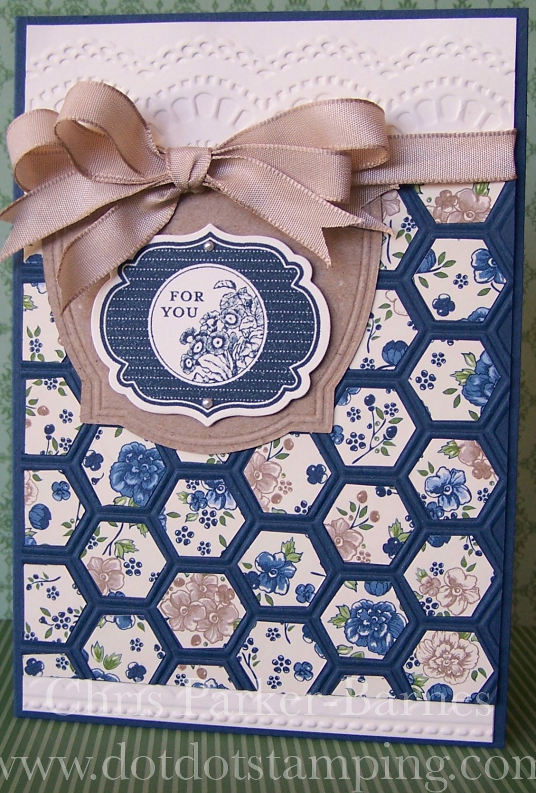
Oh no, Pretty in Pink is soon to be leaving us!  If you didn’t already know, Stampin’ Up! have done a colour renovation and with the new catalogue in July, will come a new set of gorgeous colour combinations.  One of the colours that will be leaving the collection is Pretty in Pink… it is such a pretty, girly pink, I am going to miss it!

I have used this week’s sketch from Freshly Made Sketches as a basis for my card and also used my Sizzlits Pinwheel die which hasn’t seen the light of day until now.  The papers are from the Tea For Two Designer Series Papers pack.  The pinwheel may look a little different to how you are used to see them, but I wanted to use just the pink side of the patterned paper without the pattern on the other side showing so I just reversed it – I think it looks a little more like a windmill than a pinwheel, but never mind 🙂  I also struggled with where to put the sentiment.  I have stamped it onto some vellum for a nice soft look, but it just didn’t quite look right, no matter where I put it. Perhaps I should have left the card sentiment free.
The other challenge that I will enter this card in is SUO Challenges, who are currently running a challenge using anything Sizzix – well, I have plenty of those!

Hope you have a crafty week.  Happy stamping!
Chris

Dynamic Duos #50

Here are the colours for this week’s Dynamic Duos challenge……

This week all the cards from the Design Team are birthday cards, a special celebration for Design Team member Vicki Burdick, whose birthday was a few days ago.  So, Happy Birthday Vicki, I hope you had a fabulous day!

My card uses the Elements of Style stamp set, firstly the swirl is stamped tone on tone onto the base layer.  The beautiful flower image has been stamped using black Stazon ink, and then I have coloured inside the black outline with markers directly onto the Very Vanilla cardstock.  I coloured the leaves in Sahara Sand, the flowers were coloured with Blushing Bride first and then with Calypso Coral over the top to add some depth and shading.  The image and the the Crumb Cake layer have both been cut using the Ovals Collection Framelits Dies, and of course I had to add some paper piercing! The sentiment is an individual stamp called Beautiful Birthday (Page 44 of the Annual Catalogue).

Sadly, this is my last challenge with Dynamic Duos Design Team, it has been a fantastic six months and I have thoroughly enjoyed the time I have spent working with this amazing group of ladies.  They are all so incredibly talented, creative and inspirational.  I am sure I will be playing along with the next lot of colour challenges and the new Design Team, so keep an eye out for the announcement of who will be taking over for the next round.
And I hope you will continue to check in here and see what I have been doing, it has been wonderful to get all of the lovely comments and I do enjoy sharing my creations with you.
Happy stamping.
Chris

Dynamic Duos #49

More fun again this week from Dynamic Duos, with an unusual colour combination and the option of making a masculine card with Basic Black and Basic Grey.

I enjoyed this challenge, but then I also enjoy making masculine cards!
Nothing too exciting about my card, I have used the Woodgrain Embossing folder for the black background, the Serene Silhouettes stamp set, lots of paper piercing (of course!) and the the patterned paper comes from the Twitterpated DSP.
Lots of gorgeous inspiration from the Design Team can be seen here.
Hope you are having a crafty weekend. Happy Stamping!
Chris

Dynamic Duos # 48

Ok I will admit, I struggled with this week’s Dynamic Duos colours…. a lot!

The first card I made started with some ideas and then didn’t turn out anything like I had intended it to.  The lovely ladies on the Design Team told me they liked it, but I am really unhappy with how it turned out.  However… I promised them I would post it here so that you can see both the cards I made with these colours.  So without further ado……..

I have used some of the Delicate Details Lace tape over strips of Pumpkin Pie cardstock, along with a doily, and the circle image is from Serene Silhouettes stamp set.  There are also layers of the Creped Filter Papers which have been punched out and then sponged with Bashful Blue ink.

The second card using these colours is a masculine one.  I have seen this idea on Pinterest, but unfortunately the card didn’t have a persons name attached to it so I can’t credit them with the idea.  As per usual though, I have changed it and added a few my own favourite techniques and ideas to it.

Firstly, I have stamped the sentiment from Wacky Wishes, then added the strips of coloured cardstock to the base (I have used some Crumb Cake along with the Bashful Blue and Pumpkin Pie).  I have then stamped in Versamark ink, the seaweed image from By The Tide stamp set, over the cardstock strips.  It is a little harder to see it in the photo than in real life.  The shell image, also from By The Tide, is stamped in Crumb Cake and then cut out by hand. And of course, I had to add some faux stitching!

Please feel free to leave a message and let me know which one you like best, and make sure to check out lots of inspiration from the Design Team.
Happy Stamping!
Chris

A New Challenge!

I love it when I find a new challenge, especially when it is one that really opens up the possibilities and gets the creative juices flowing.  Well done to Lesley and Jackie for coming up with this idea, and thanks for all the inspiration.

And here is my first Fusion card.

I have added my own challenge to this as well, I really want to get good at making Clean and Simple cards.  I do find it difficult leaving lots of white space and not using heaps of embellishments, ribbons, lace etc but it will be good for me to learn something new!
It just so happens that this week’s CAS-ual Fridays challenge is to use Chevron and Flowers, so I will enter my card in that challenge as well.


The colours are just gorgeous, aren’t they?  Daffodil Delight, Tangerine Tango and Melon Mambo.  The yellow Chevron paper is from the Parker’s Patterns DSP, and the greeting from the gorgeous Kindness Matters stamp set.  The flowers look like they have dark blobs in the middle of them, but actually it is just a dob of silver Dazzling Details – the shiny stuff just didn’t show up in the photo.  Have to have a little bit of bling!
Hope your day is bright and sunny!
Happy stamping!
Chris

Dynamic Duos # 46

This week’s Dynamic Duos challenge is to use the colour Primrose Petals and combine it with a colour of your choice.  Well, now that just leaves it too open for me, too many possibilities and ideas……
I decided on combining my favourite colours of all, pink and purple….. so I have added Elegant Eggplant to the Primrose Petals.

My card uses two techniques that I haven’t played with for a long time.  Firstly, the Stained Glass technique, combined with the Tissue Paper technique.


To do this, I have embossed the Swallowtail in white embossing powder onto the smooth side of the Crepe Filter Paper (page 6 Seasonal Catalogue) – if you feel the paper really carefully you will notice that one side is slightly smoother and the other side a little more rough. The Stained Glass technique is usually done onto Vellum, which is much stronger than the crepe paper, so I wasn’t sure how this would turn out.
Then on the back, behind the butterfly image, I have coloured using inks and a blender pen, in the two colours, blending them together.
I embossed an extra butterfly to experiment with, and gave this one to my son.  He coloured the back of the butterfly directly with brightly coloured markers, and that worked really well too, so you could do either of these.  However, it does work best if the colouring is on the back of the embossed image.
I have then wrapped the crepe paper over a piece of Shimmer White cardstock, and stuck it behind the cardstock using glue to keep it in place.  If you are using standard tissue paper for this technique, it is nice to scrunch up the paper to give it more texture, and then smooth it out again, but this crepe paper is a little heavier and I thought it would detract from the image, so I left it flat.
While you can’t see it in the photo, the shimmer of the cardstock does show through the crepe paper.
The lace, seam binding ribbon and gorgeous resin rose, are all from the Artisan Embellishment Kit (page 10 Seasonal Catalogue).

As always, heaps of inspiration from the rest of the Design Team at Dynamic Duos, all using different colours for their creations.

Happy Easter everyone, I do hope you are having a crafty Easter, and spending time with loved ones.
Happy stamping!
Chris

Honeycomb Embossing

I have wanted to try this out for some time now, and yesterday was the perfect time to sit down and do some fussy cutting.   Is it only me, or does anyone else find fussy cutting relaxing?  A bit like watercolouring, knitting and crocheting…..


Perhaps one day Stampin’ Up! might bring out a punch to coordinate with the Honeycomb Embossing Folder used here, but for now, each piece of the patterned paper had to be cut by hand.   I have also used one of the Needlepoint Border Embossing Folder along the bottom, and one of the Delicate Designs Folders along the top.  Can you tell that I love my Embossing Folders?? 🙂
The Crumb Cake coloured layer is one of the pieces from the Pop Up Posies Kit which I have cut one edge off and popped under some Crumb Cake ribbon, and the greeting comes from the Apothecary Art stamp set.  Oh and mustn’t forget that gorgeous patterned paper, which is from the current seasonal catalogue on Page 16, called the Print Poetry Designer Series Paper Stack, lots of beautiful papers in it and they are great for cardmaking.

The sketch I have used for this card is this week’s sketch at the Freshly Made Sketches challenge site, and I always love a sketch challenge, so thought I would have a go at this one.
If you have any questions about this card, please feel free to contact me or leave a comment.
Happy Stamping!
Chris

Monochromatic Pinks

Definitely a “girly” challenge this week at Dynamic Duos,

and I have combined the pinks with black and white.

My card uses the Blooming With Kindness stamp set, which is a bit of a favourite at present.  The main flower image has been stamped twice, slightly off-set, once in Pretty in Pink and once in Regal Rose.
The ribbon is gorgeous but unfortunately retired quite a few years ago!

I apologise for the short post today, I have spent most of my day at a local model train exhibition with my family, it was fantastic, but I am feeling a little weary, so time to rest and recover!  Maybe some stamping 🙂
Lots of inspiration again this week from the rest of the Design Team, and please share your wonderful creations with us at Dynamic Duos.
Happy Stamping!
Chris

Dynamic Duos #44

This week’s colours can be used in a lovely subtle, pretty way, or used in a bold or modern way.  I have chosen pretty and subtle this time, but I am loving some of the bold ideas I have seen.

My card uses the Bordering on Romance stamp set again, the images have been stamped in black Stazon ink, and then I have used So Saffron and Sahara Sand markers and drawn around the inside of the stamped image, giving a very subtle colour to each area.

The pretty flowery brad is one of the new Designer Builder Brads in the Seasonal Catalogue (Page 12) and the gorgeous ribbon is unfortunately a retired one.

Make sure you check out the inspiration from the rest of the Design Team, and feel free to send me an email if you have any questions about my card.

Happy Stamping!
Chris


Direct Ink meets Triple Stamping….

… actually in this case I think it is Double stamping.  I am not sure of the correct name for this technique, I have seen it called a number of different things, but whatever it is called, it is a great technique.

This first card I am going to enter into this week’s Retro Sketches challenge since it was their sketch that inspired me 🙂

I have used the Direct Ink onto cardstock technique using the colours Pool Party and Old Olive, and then I have used the Triple stamping technique for the silhouette in Basic Grey.  The silhouette image comes from one of my all time favourite stamp sets Serene Silhouettes.

The second card uses similar techniques only this time I have used the ink directly onto the clear block and then stamped that onto the cardstock.  It is just a little more subtle, but still very effective.  The colours are the same, only this time it is the French Foliage stamp set (another favourite!)


If you like the Triple Stamping technique, live in the Canberra area, and would like to learn more about how to use this technique, I will be running classes on Tuesday 26th March at 1pm and Wednesday 27th March at 7.30pm.  Bookings are essential as places are limited, so contact me asap to book your seat.  I will also organise a class on the Direct Ink techniques, probably in late April or early May, details coming soon.

Happy stamping!
Chris